
Is Your Dealership Mobile-Ready?
July 3, 2018
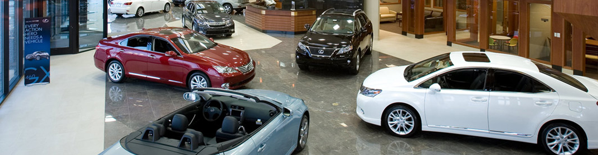
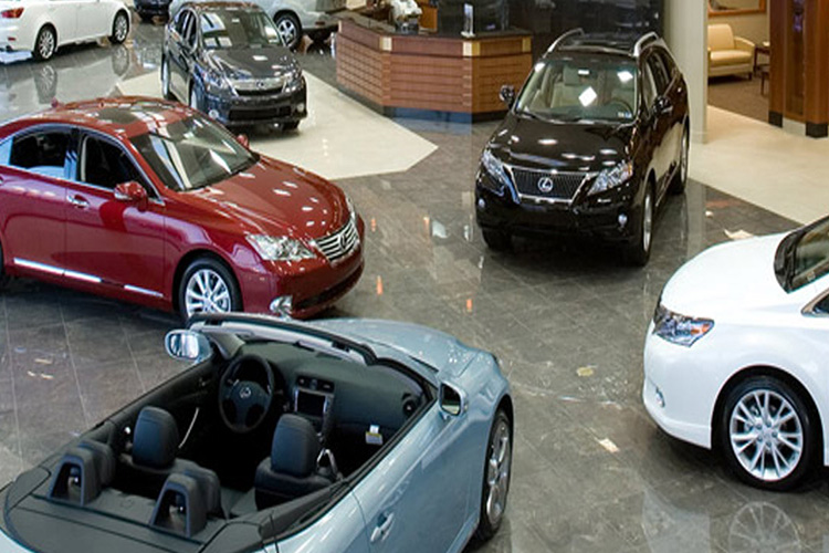
Customers don’t buy cars online, but you might be surprised how many of them do online research before they step into a dealership. A recent estimate puts the number at 86%. Many of them are doing this research through smartphones, which means that if your dealership isn’t putting their best mobile foot forward, you’re missing out on a lot of sales.
What is Mobile Readiness?
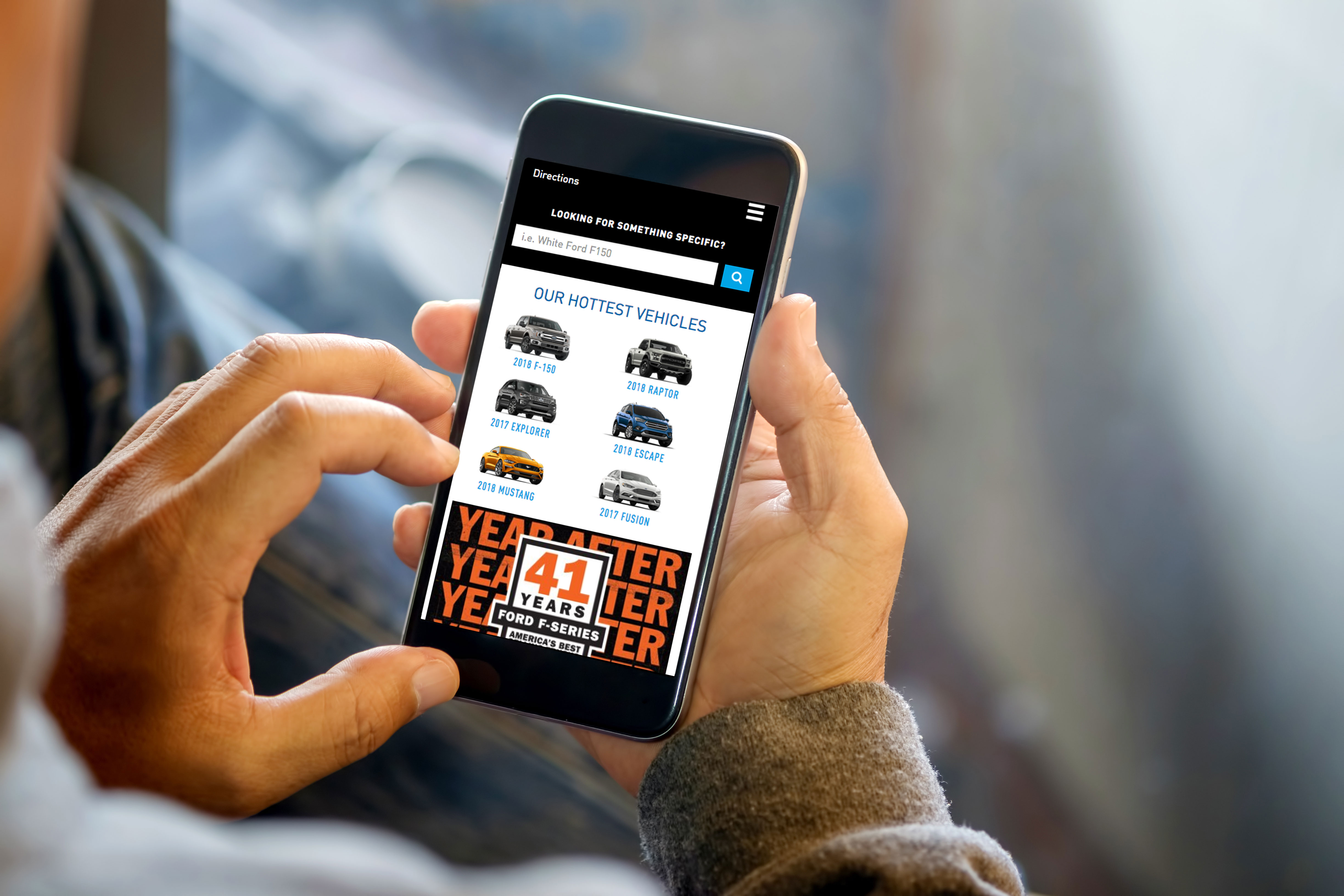
In its most basic form, mobile readiness means that your website operates properly on mobile devices. Due to the differences in screen size between standard computers and smartphones, websites that are easy to use on a computer can be hard to use on a smartphone. Now that more people browse the net with smartphones than computers, a significant part of your customer base will expect a positive mobile experience.
It’s not just about customer experience, though. Search engines are starting to penalize domains that don’t have mobile-ready sites by pushing them down the ranks when people search with a mobile device. Google has already declared that they are switching its entire operation to a mobile-first philosophy. So if you wish to retain your search engine ranking then mobile readiness is a must.
Mobile readiness also involves creating advertising campaigns that are built for mobile devices, such as creating ads that fit the format. But in this piece, we’re going to focus on website readiness as that needs to be in place before building a mobile advertising campaign.
Checking Mobile Readiness
Fortunately, Google isn’t leaving websites high and dry with this change. Having a mobile-ready site isn’t a new concept, and they’ve been warning that they were going to make significant changes for some time now.
To help website operators get ready, they’ve released two free tools you can use to check your domains. The first is their Mobile-Friendly Test, which checks how your site looks on mobile devices. The second is their Mobile Speed Test, which sees how quickly your site loads.
Fast-loading sites are a crucial part of mobile readiness for two reasons. First, no one likes a slow site. 53% of mobile site visits are abandoned if a site loads slower than three seconds. Second, slow sites are often that way because they have large file sizes. This causes increased data consumption. So, optimizing photos of vehicles and videos is an important part of mobile readiness.
Creating a responsive site, that is, a site that can respond automatically to different screen sizes, is a key part of making your site mobile-ready. This is a much better way than the older method of creating two separate sites since you don’t have to worry about maintaining the two at the same time. It’s simple to check to see if your site is already responsive. First, try viewing it on a smartphone. If it looks good there, open your site on a normal computer then shrink the window. At a certain point, the layout should change to match what’s on your smartphone, showing that the site responded to the change in the viewport size.
Both of these sites will offer tips on how to improve your mobile readiness. A little bit of work now can save your customers and your rankings a lot of trouble. Take some time to do some testing this week!