


Improve the Forms on Your Website to Capture More Conversions
March 21, 2019
Congratulations! Your product, your content, and your streamlined, clutter-free site design has landed a customer on your contact form page. And then… poof! They go away! Before you can even get an e-mail address, they’ve jumped to another page.
Before you go looking at your content, your copy, and your site to try and determine where you went wrong, you might want to take a look at your conversion form. Small annoyances in your conversion form can send a potential conversion bouncing to another site. At the same time, you don’t want to make it so small that you lose out on getting valuable information about your customer.
Where do you find the balance?
Here are a few things that you can probably do to improve the forms on your site to get more lead conversions:
- Shorter is Better
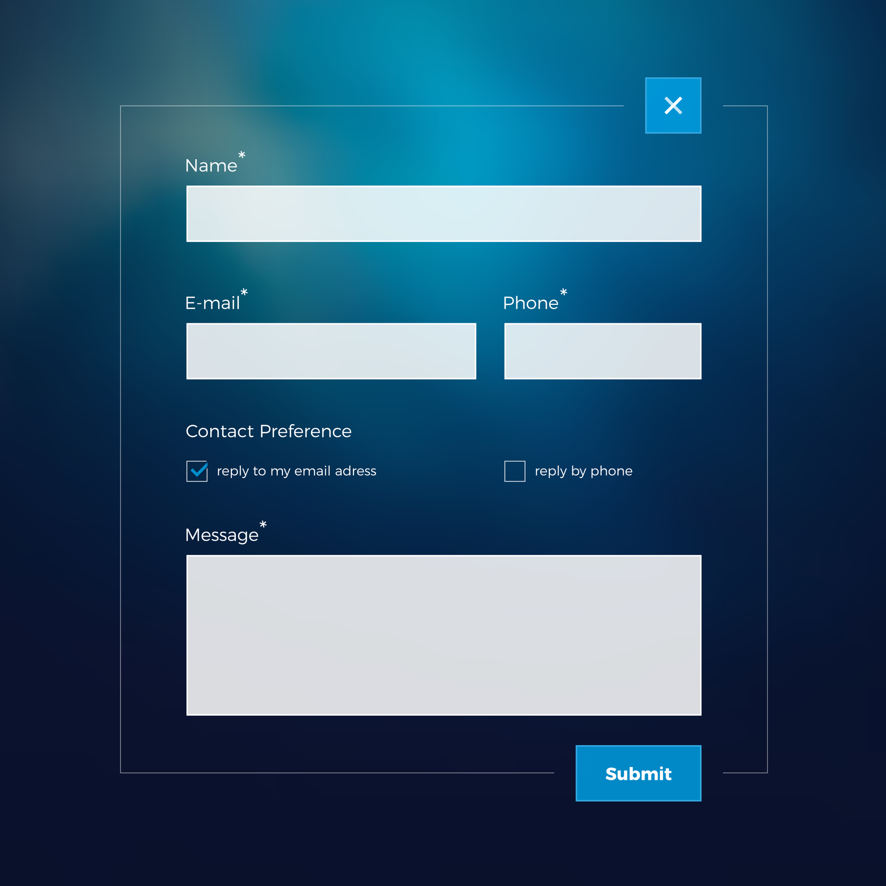
The best practices call for between 3-5 fields in your form. In fact, research indicates that decreasing your number of form fields to four or less can increase conversions by 160%.
- Your CTA Button is a Snoozefest
Nothing says “zzzzzzzz” like a generic “submit” button at the bottom of your form. This is a call to action, so make it an inspiring one! Consider not only the words that make up your CTA button, but also give careful consideration to the color. Red may be eye-catching, but don’t discount other colors like green or blue. This is what A/B testing is for.
- You’re Using Captcha – Or You’re Not Using Smart Captcha
Studies indicate that a majority of people find captcha, which is intended to root out spam and unlikely conversion leads, annoying. Make sure that you’re using smart captcha, which only verifies a person once.
- You’re Asking for – No, Requiring, a Phone Number
If you want almost every potential conversion to go running for the “x” button right away, you can always ask for a phone number. People are busy enough without having to filter phone calls and talk to persistent salespeople all day. In fact, by simply making the telephone number field from required to optional can lower abandonment rates from 39 to 4 percent.
- Ditch the Dropdowns – Or at Least Be Picky with Them
Drop down menus may give potential leads more options, but they may not be ideal for those using mobile phones or tablets. However, you might not want to ditch them entirely because they are effective in B2B marketing. Instead of leaving the dropdown menu behind, consider exactly how many options that you need in it.
Hopefully, this article has given you some ideas on what you can do to change your submission form to grab even more conversions. From streamlining the number of fields on your form to including a call to action button that’s inspiring, there are quite a few things that you can do to improve your conversion rate. Try a few of these and see which ones work best for you!